A Javascript Google Search Tweak
Published Monday, March 27, 2006 by Gautam Kishore | E-mail this postA new search results interface is in the works at Google. Originally the domain of rumor sites,
it's now possible for almost anyone to get a glimpse of the new look. The existence of a simple
trick that enables the interface for nearly any browser makes it all possible.
The steps are as follows. First, navigate to google.com (or whatever Google search server
you use, e.g., google.co.uk). Second, paste this string into your address bar, and hit enter
(and ignore whatever message it spits back at you):
javascript:alert(document.cookie="PREF=ID=fb7740f107311e46:
TM=1142683332:LM=1142683332:S=fNSw6ljXTzvL3dWu;path=/;domain=google.com")
Note: the sting must be a continuous, single-line entry. Additionally,
the portion "domain=google.com" should be modified to whatever Google search server
you are using (e.g., google.co.uk; we have verified that this works with the UK and US
servers... it may work with others). Third, search away. You should now see the interface.
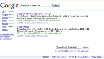
And there you have it. As you can see, the changes are minimal, but they give some
insight into Google's plans. The biggest change is the relocation of Google's search
categories. Originally on top of the page in a horizontal layout, Google has now placed
them on the left alongside visual representations of the search query's relevance in
these other categories.
Google's intentions aren't clear, but in the last day of using this interface,
I've noticed myself repeatedly looking directly at the leftmost column. It's where
the results used to be, and perhaps more importantly, it's a natural place to start
scanning the page for left-to-right language types. Since the relocation surely
serves a purpose, I'll take a stab at what that purpose is.
First, the position is privileged for the reasons outlined above. Furthermore, by
displaying a visual representation of your query's success in these categories,
Google is enticing users to explore. In short, the move is meant to draw more
attention to Google's niche search areas.
Two other side-effects can be noted. First, the relocation allows for the actual
search results to start higher up on the page. This is good because it means
that users can expect to see more per "window." It's also "good" because this
means that Google's text ads can start higher on the page as well. Second, by
displaying the categories in a column, Google has plenty of vertical space to
play with when it comes to adding additional categories. Its previous placement
was limited by horizontal space, and was pushing the page down. With this layout,
Google has room to grow.
About me
- I'm Gautam Kishore
- From bhopal, mp, India
- I am just another guy fascinated by the technology and innovations since i was born ;)
- My profile
Previous posts
- Google Official Blog Hacked !!!
- Google: Ten Golden Rules - Issues 2006 - MSNBC.com
- Google's Patents Reveal Strategy To Beat Microsoft
- GoogleNet Continued...Welcome To The Future
- Google Finally Forms Partnership With NASA !!
- Google + NASA = ???
- Firefox Toolbar Out Of Beta
- Google to Remove Boast About Index Size
- Happy B'day Google... you are 7 now
- GoogleTV Coming Soon?
Archives
Links
 ATOM 0.3


This work is licensed under a Creative Commons Attribution-NonCommercial-ShareAlike 2.5 License.


0 Responses to “A Javascript Google Search Tweak”
Leave a Reply